

ColourColour Chat: Rose Quartz & Serenity
``Rose Quartz and Serenity demonstrate an inherent balance between a warmer embracing rose tone and the cooler tranquil blue, reflecting connection and wellness as well as a soothing sense of order and peace.``
What’s not to love about this delightful pairing of pastel colours? Rumour had it that Rose Quartz would be Pantone’s pick for 2016. By fall 2015, it had already featured in designers’ Spring 2016 collections. As it turned out, the rumour mill was only partly right.
Pantone has done a great job selling their choice of colours. That iconic scene in which the two colours are seen blended on a lady’s scarf deserves all the attention it has received.
These pastel variations of pink and blue are actually more familiar than you might realize. As many in the design community have pointed out, they are popular with baby products and decor.
Nature also highlights these colours in her own way. We have soaked them up in the light of a pale sunset and as the Arts Writer at the Huffington Post notes, we have seen artists use them to render their visions of nature’s beauty.

In the world of beads where I work, the appeal of this pair is even closer to home. Its pastel pink is rightly named after the semi-precious gemstone, Rose Quartz, whose best colour it mirrors perfectly.


The other half of this pair can also be found in a number of gemstones. Blue Lace Agate, Blue Chalcedony and Blue Moonstone all show mixed tones of Serenity. Blended, Rose Quartz and Serenity create a lovely Lavender purple found in pale shades of Amethyst.


COLOUR PALETTES
Is it wrong to have favourites? I ask because even though it’s a two-in-one package, I have a strong preference for Rose Quartz.
It’s easy on the eyes and easy to work with. Infact, the challenge with Rose Quartz is how to combine it for a sophisticated look that’s out of the ordinary.
I think Rose Quartz looks best when combined in a contrasting way. Alongside intense colours, it has a softening effect that makes for a more harmonious whole.
Take a look some easy ways to combine Rose Quartz.

With Metallics
Rich yellow golds and dark silver grays contrast nicely with Rose Quartz. Other metallics like Copper, Bronze and Brass also work well.

With Serenity
This pair of colours work very well together. Whether you choose to use them in colour blocks or opt to blend them as Pantone did with their iconic scarf, the outcome will be very much on trend.

With Intense Pinks & Plums
It should come as no surprise that this lot look so good together. I must point out that warmer shades of pink and purple seem to work better than cooler ones.

With Browns
Browns with red and orange undertones make a fine combination with Rose Quartz. It goes to show you can combine Rose quartz with you wardrobe staples.

With Orange
Much like the preceding set, this combination exudes a charming warmth. It’s definitely a great palette for spring.

With Beige
This combo would make a beautiful matte eyeshadow palette for coloured women. If this were a real eyeshadow palette, I would recommend applyiny a base underneath. This will keep the colours looking crisp throughout the day.

With Green Cyans
This has to be my favourite way to combine Rose Quartz. It is a bit unusual and yet oddly familiar. It reminds me of a beach with emerald waters, beigey sands and a pale pink sunset.
Follow HMJS ♥
-
 10Mar
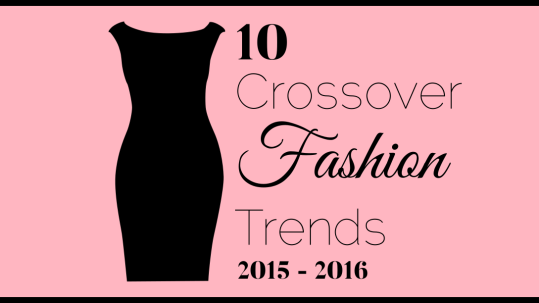
10Mar2015 – 2016 Crossover Fashion Trends
Ah Fashion! If you're a fashion lover you'll recognize all the trends below because we totally enjoyed them in 2015. They graced runways and were do...
-
 15Jul
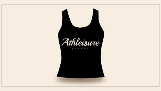
15JulAthleisure
We see it everywhere. It's the new cool. It looks comfy, it feels comfy and it's proudly sporty. This trend is aptly called Athleisure, a concatenatio...
-
 20Mar
20MarBeads and Print Fabrics
Beaded jewellery look great on print fabrics. However, there're a few things to consider when choosing which accessories to pair with what print....
Sorry, the comment form is closed at this time.