

ColourEmerald Palettes
Pantone® named ‘Emerald’ the colour of the year 2013 [HERE], And whether you associate this colour with the gemstone or with nature’s lush greens, I’m sure you’ve kept an eye on all things ‘Emerald’.
Here are 8 sampled shades of emerald including the Pantone® selection (starred).

Muted colours & neutrals work well with Emerald because they accentuate its strong, dominant presence.

Using a cast of supporting colours however, is only one way to get the best of Emerald. The 6 palettes below show other ways to combine and wear Emerald with ease.
— 1 —
Combine Smartly with Floral Pinks! This one’s inspired by nature. Consider how often we marvel at beautiful pink clusters (flowers) in glistening seas of emerald (leaves).

— 2 —
Combine with deep Pinks & Purple. Very attractive; very dramatic! Think of this as an exaggerated version of the floral option.

— 3 —
Go for Gold! Inspired by Gold Emerald Jewellery. Looks just as nice in beaded jewellery & print fabrics.

— 4 —
Combine with Turquoise. This is a beautiful palette. Having a few neutrals in there gives it balance.

— 5 —
Finally, Emerald combined with Peach or Orange simply oozes Chic Sophistication!


-
 22Feb
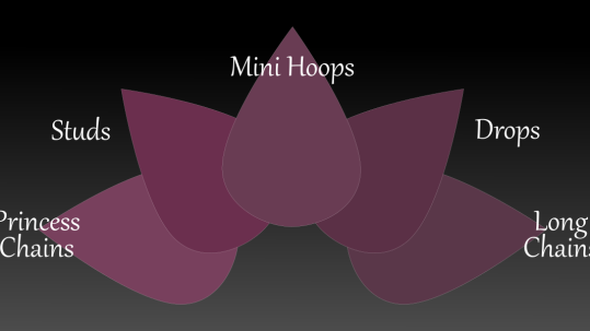
22FebYour Basic Jewellery Suite
'Everyday Accessories' & 'Everyday Jewellery' satisfy needs that are simple and yet essential. For time, we have the wristwatch; To honour our relationships, we have engagement, wedding and friendship bands; To show our ...
-
 23May
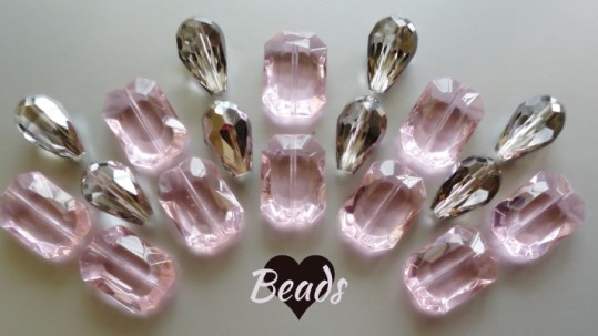
23MayWe ♥ Beads
Seeing is believing!!! However, knowing 'Why' helps us understand what we see and what we believe. Simply saying that most women love beaded jewellery would be stating the obvious. The signs are everywhere, especially in...
Sorry, the comment form is closed at this time.